Thursday 16 October 2014

LES BLEUS DE RAMVILLE

Les Bleus De Ramville

We looked at the opening titles of French, award winning film Les Bleus De Ramville. 
The establishing shot is a camera in a locker. At first the screen is dark until a ice hockey jersey top is removed from the lense.
 I looked at the camera angle of the jersey being removed from covering the lense and showing that the camera is in fact in a locker. Showing the player prepare for his game in mid-shot. I could use something like this in my work by having something cover the lense and remove it so the set becomes clear. I could also do something like the camera in the locker by either resting the camera in it or using wood to create the look of a locker.


I looked at the camera work. This is a low angle tracking shot of someone walking up steps to their seats. The low angle shot shows the feet as they walk. The tracking shot follows them as they walk to the side. This shows they are going somewhere, i can recreate this by using low angle shots and a dolly for the tracking angles.


This is an over-the-sholder-shot as the players walk to the ice rink. I like this as the shot when the cut happens there is a change in pitch in the music which emphasises the cut change. This shot shows the tension as they are all in an orderly line. To do something like this I could do over the shoulder shots while someones walks.


This is effective as you can see their game play and tactics develop in the shot. I would like to use something like this to interest my viewer. I could do something like this by using a stop-motion, as the game play develops. The look gives it a neat and precise look along with adding tension to the opening titles to increase excitement for the game.


This is a low angle shot to show the precise movement between two characters just as they drop the hockey puck, to what seems, on the camera. I will use this technique in order to show a variety of camera angles and emphasises something dropping in a scene.

This shows the atmosphere to the audience of the ice hockey games, showing the violent ways. The set is the ice hockey rink, showing the audience very clearly where they are and what they are doing. The lense flare from the left upper corner draws attention to the scene and makes the user look which I would like to do in my own work, the bright coloured light making the audience look at the Mise-en-scene.

A birds eye view, tracking shot was used to show a players movements when following the hockey puck. This adds effect as it increases tension and excitement for their games and playing. To re-create this i could have the person hold the camera as they do there activity.


This is a close up shot of the puck being scored into the goal. The clip is in slow motion so it fits the music and also gives the viewer more time to see it, becoming happy for the score. The red lense flare in the right corner which could possibly be the score board; brings the attention and makes the viewer focus as it adds to the dramatic tension.


The spilling of drinks and popcorn in this low angle shot shows the crowds excitement and buzz for the ice hockey team. The titles coming in clear, easy to read font in the area of the shot where it is not too busy. This gives it a good look as the title is placed well. I would like to use the idea of placing the title in an area where there is no noise to distract from it to give my work a professional look.


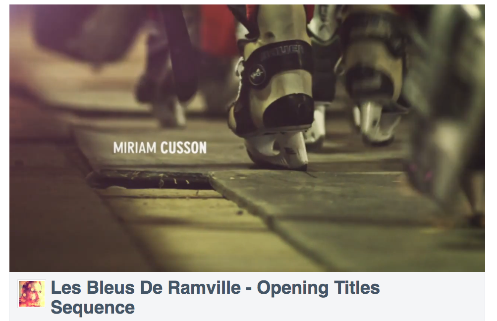
This is a low angle shot which shows the players ice boots as they walk to the game. This shot is affective as not all the players boots are in focus, only the one next to the name is. This draws attention to that area so the viewer sees the name of the cast or set member. The name itself being just out of the way of the boots so the screen does not look crowded. I would like to use something like this so the names come across clearer in my own work.


I looked at the title of Les Bleus de Ramville in order to learn about the stop motion and use it in my own work.The title of the TV show developes creating a very slick and crisp end to the opening sequence. The colours on the logo are opposite each other in the colour wheel making the word 'Ramville' stand out against the orange. 


I could use something like this in my own work by using a stop-motion, as it will give the same look of title developing on the screen. I will also use the idea of colours on each other that are opposite on the colour wheel in order to make the title stand out.

Tuesday 14 October 2014

SUITS

I looked at the opening sequence of the TV show 'Suits'
The suits establishing shot dissolves the screen into the shot using a grid of squares. The shots are coloured very dark, using blues mostly showing a solemn mood.

They use extreme close ups of the lawyer getting ready, such as pulling down his suit arm or doing his tie up. This shows him preparing for a busy and hectic day.
This shows how they are in New York while still using blue colours to show a gloomy mood.

 They change colours by using a dissolving look and a lense flare. The colour change during the tracking shot could show a change in the time of day and mood. The colours become warmer in the next shots, they also show a new person.
The scene changes are quick to show the quick hasty life a New York Lawyer.


At points in this opening sequence they have slowed down some of the clips and have the next section in normal motion so it looks faster. This made the normal motion look faster and show the fast showing motion of a New York Lawyers life. I thought this was impressive and will use something like this in my work to show how time moves quickly.

Friday 3 October 2014

RESEARCH; THE ART OF THE TITLE

Today I looked at opening scenes of title sequences in more detail. I looked at a website called The Art of The Title http://www.artofthetitle.com for inspiration and also used my own knowledge.

Détectives (2013)

I looked at the opening segment of a TV show called 'Détectives', I then analysed it:
  • It is a detective thriller/mystery TV show. The title sequence has a sense of mystery and piecing clues together, showing what a detective may do, e.g. tracing a number plate of a car to find a suspect. Then showing how all the people are linked together.
  • The set out is as if they are looking throw google maps, and planning a route. Due to the mouse cursor dragging the camera around. Then there are tracking shots around France finding more clues and suspects.
  • The colours are quite warm toned to show the brightness of the country and how it is shown through a computer. 
  • The tracking time lapse shots are effective as it shows how long a detective will spend looking for clues and suspects. It also gives the effect of rushing, like a detective would be rushing to get the work down and get the right criminal. 
  • The music is catchy and quite upbeat yet still fits the genre. The lyrics fit as at the end the words "When you know" are repeated three times; as if to mock how the detectives do not yet know who the suspect is.
  • The font is constant, and clear to read changing between black and white if nesacarry. The black and white shows justice and a black and white case that the detective needs to solve. At the end when 'Detectives' comes up the S is red, this could be to show blood and link back to a case. Or it can also mean unknown as the colour is used with detectives and police officers to link suspect but the link is still unknown.


The Conjuring (2013)

This is the title pages of a film called The Conjuring which I decided to look at:
  • The genre of this film is a horror that is based on a true story and set in 1971. 
  • The titles very cleverly come up using either newspaper headings or presentation screens. The use of negatives is also used with the newspaper articles printed on them and by adding another layer it gets darker. A negative layer may also say a name of someone who worked on the film and be places over the articles. This is used as the film is based on real life events so the newpapers are used as if they are looking for clues that had happened.
  • Inverted colours was used to give a spooky feel to the titles and really set the atmosphere of mystery for the film. They also use old fashioned techology e.g. microfiche to verify the real life events.
  • The music is also very gloomy to set the mood.
  • The camera is kept still and only the negatives move and change, sometimes a fade in and out cut has been used.
  • The font is constant and always the same, in clear, bold easy to read letters which are always in negative and inverted colours.


Lie To Me (2009-2011)

I looked at the opening segment of a TV show called 'Lie to Me' I then analysed the opening:
  • The genre is a crime/thriller TV show. The opening section of this show is showing all the tells people can give in a lie. For example if they clench their fist, they maybe angry. They show this on the opening by having a computer generalised line going from the tell to the emotion they're feeling.
  • The background is a bright white wall. This could be like a spotlight and be used to intimated people, as if they were being interrogated.
  • The camera stays still as it is on a tripod, as if the person is being interrogated and being recorded. This fits in with the genre of the show.
  • The colours are quite cold and dark, some clips are even grey-scaled. This sets the tense atmosphere of the show, the grey can show how the person being interrogated try to be conserved and not show their emotions. The black and whites also being used to show justice and a black and white case, such as the white is innocent and black mysterious.
  • The first clip is a man (the interrogator) leaning in, the edges black and blurry as if he is looking through a peephole, or microscope to inspect the suspects. Then at the end he leans back out and stand upright as if he is satisfied with the information he has gathered.
  • The music starts off slow however rapidly picks up. The music is quite fast and impulsive, maybe how someone would feel when committing a crime or being interrogated for one due to the adrenaline. 
  • The font is clear and easy to read, using black and whites for lighter or darker backgrounds. Black and whites is used to show the authority and justice of the case.


Thursday 2 October 2014

REPRESENTATION


Barthes wrote about myths that were the dominant ideologies of our time. On the cover of the Paris Match magazine is a young Negro in a French Uniform who is saluting, his eyes uplifted on the French flag. This shows that without any colour discrimination people will faithfully serve the country, trying to pull the country together as everyone is singing under the same flag and the same lyrics, no matter the militariness and ethnic differences. Bathes likes using semiotic which is the study of meaning-making.


  This image shows a grocery bag containing ingredients needed to make a pasta, with pasta, tomatoes, cheese and canned sauce flowing out of the bag. Using this image Barthes turns the contents of the bag; vegetables, pasta showing a certain brand. This picture is designed to tempt us into buying and serving this brand of pasta and canned sauce instead of making the sauce our self. He does this by having the vegetables in the bag also so the canned sauce looks just a healthy with them. The message hidden in the advert is showing freshness and health.


In this poster for the film stuck in love we see three different rows all showing a picture of a boy and a girl. On the right hand side we have the three main characters all focused from the same family. The top row has the oldest couple; the mother and father. The bottom row has the youngest child, Rusty, and his girlfriend Kate. In the middle row there is the middle child, Sam and her boyfriend Lewis. Although all three are different images, all together they show how love has no age. The dark colours however showing the doubt the family has with love due to seeing the mother and father's (top row) relationship crumble and fall.